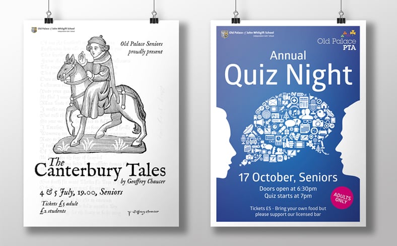
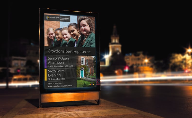
Past, present and future
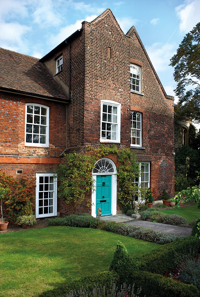
The Old Palace of John Whitgift School has a history longer than Simon Cowells white T-shirt rail. As the name suggests, it originally was the summer residence of the Archbishops of Canterbury of whom which John Whitgift was one of them, and it was he that founded the charitable association, The Whitgift Foundation, that runs the school today.
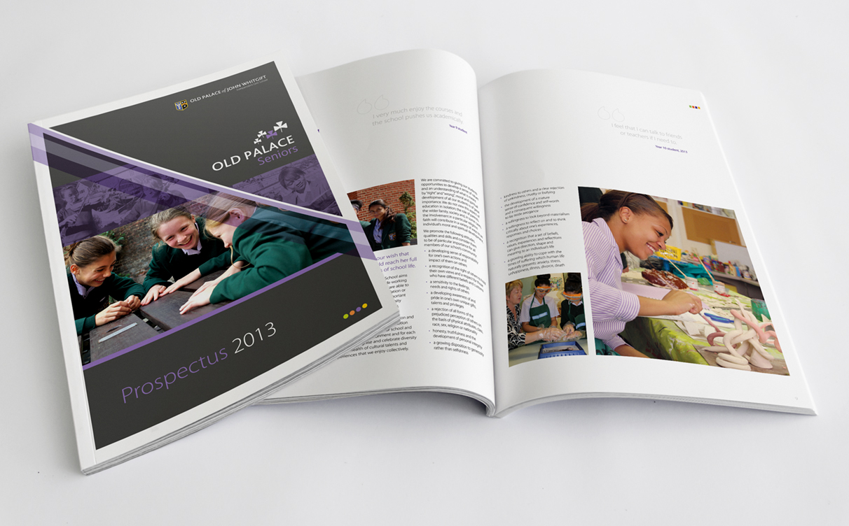
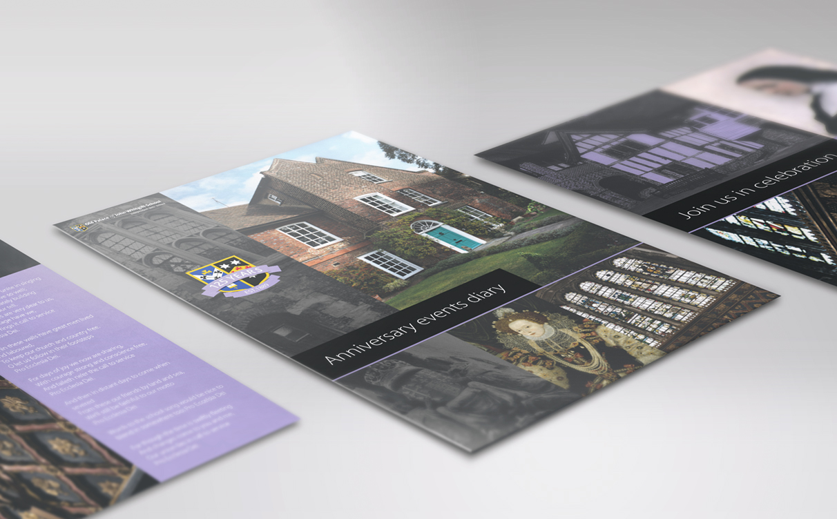
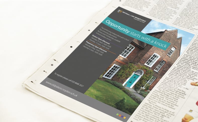
With it’s long history in mind, the thinking here with the brand was to reflect that past with the use of modern fonts that have an historic flair, embrace a colour coding system to divide the four year groups so association with each is more visual based than text based and for practical reasons, so sizing of logo doesn’t go too small in tight ad space considering that it’s a long name for a school, a “School” has been removed from the logo.
It’s an ongoing project that is taking time to develop as there a many areas of media to consider, as you can see from the samples below, but the goal is to make the many branches of this wonderful school, with it’s mix of historically old and new modern buildings, it’s diverse culture of students, and its academic achievements, show through in the brand.


